• Welcome
  • Blog
  • Contact
  • Behind The Shorts
  • Old Friends
  • Previous Press
Menu

The Shorts

THE SHORTS
  • Welcome
  • Blog
  • Contact
  • Behind The Shorts
  • Old Friends
  • Previous Press
×

Short-Form Video: Bite-Sized Content, Big Impact

Rebecca Rothstein September 19, 2025

Scroll any feed and you’ll see it: quick, punchy videos grabbing attention instantly. Short-form content isn’t just a trend — it’s the default format for an entire generation.

What It Means
Platforms like TikTok, Instagram Reels, and YouTube Shorts prioritize videos under a minute. The goal is simple: capture attention quickly and keep people watching.

Why It Matters
Short-form video fuels engagement, boosts discoverability, and allows brands to show personality fast. It’s also incredibly shareable, making it a growth engine for organic reach.

How It’s Showing Up

  • Quick tutorials and product demos

  • Behind-the-scenes peeks at brand culture

  • Playful trends and challenges that ride cultural waves

The Short of it
Brands that master short-form storytelling can build deep connections in seconds. Attention spans may be shrinking, but the impact is bigger than ever.

Voice and Visual Search: The Next Frontier

Rebecca Rothstein September 17, 2025

Typing is optional. People are now using voice and visuals to find what they need.

What It Means
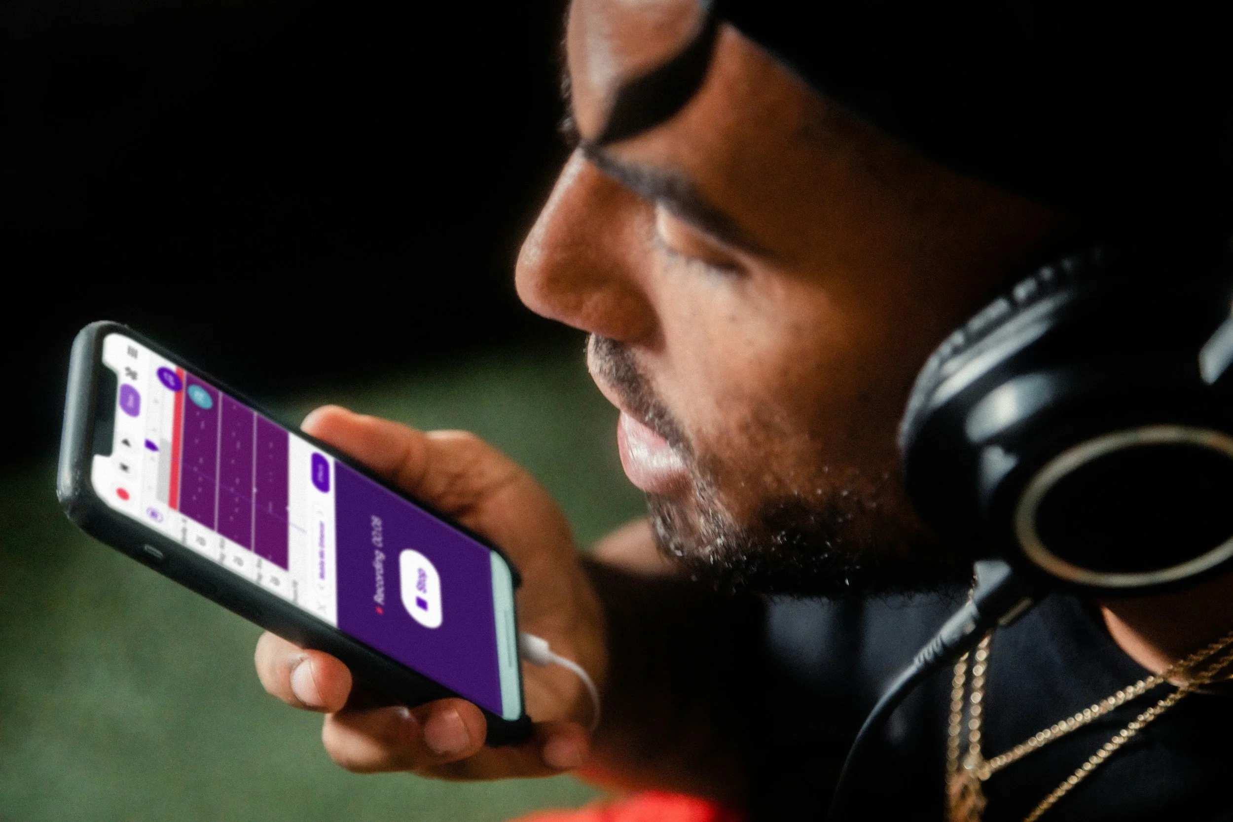
Voice search uses natural language queries on smart speakers and phones. Visual search allows users to upload or scan an image to find similar products or information.

Why It Matters
These tools make discovery more intuitive. Brands that optimize for voice and image search can capture audiences in moments of curiosity or intent.

How It’s Showing Up

  • Shoppers snapping photos of outfits to find similar looks online

  • Smart speakers answering local business questions

  • Retailers optimizing product images for search compatibility

The Short of it
Voice and visual search aren’t futuristic anymore — they’re mainstream. Optimizing for them now gives brands a competitive edge.

When Fashion Meets Purpose: Noah Wyle, FIGS, and a Tuxedo with a Message

Rebecca Rothstein September 16, 2025

Every once in a while, a red carpet moment does more than turn heads. It tells a story. At the 77th Primetime Emmy Awards in September 2025, Noah Wyle delivered one of those moments. Wearing a custom tuxedo by FIGS — a company known for medical scrubs — Wyle didn’t just dress up for the night; he wove together his acting work, his advocacy, and a tribute to healthcare workers into what he referred to as “Black Tie Scrubs.”

What Happened & Why It Stands Out

  • The outfit: The tux was made in midnight blue with classic styling — peak lapels, clean tailoring — but infused with signature touches from FIGS. The inner collar of the dress shirt bears the phrase “Awesome Human,” echoing the brand’s slogan, “Awesome Humans Wear FIGS.” (Let’s just say subtle branding, big meaning.)

  • The inspiration: Wyle says the idea came during the Gotham Awards. After someone asked him if his tuxedo was as comfortable as the scrubs he wears on The Pitt, he challenged FIGS: make one that is. And they did. The result blends red carpet formality with the ease and empathy of healthcare apparel.

  • The symbolism: Wyle’s character on The Pitt is Dr. Michael “Robby” Robinavitch, so there’s an in-show tie to scrubs already. This tux wasn’t just a fashion statement — it’s a love letter to healthcare workers, people on the frontlines. It’s a rare red carpet piece that reaches beyond glamour to purpose.

The Significance: Why This Matters

  • Fashion as advocacy: It’s powerful when what someone wears becomes a platform. Wyle didn’t just choose a look; he used the look to highlight healthcare workers, to see them, to validate them. That shifts the red carpet from spectacle to statement.

  • Branding + authenticity: FIGS isn’t a luxury fashion house; it’s a brand built around function (scrubs), comfort, the medical community. Partnering with Wyle in this way pushes their identity outward: That their apparel matters not just in the operating room but in culture. It’s a bold move to extend beyond healthcare workplaces into red carpet visibility.

  • Cultural resonance: The timing feels especially relevant. With continuing conversations around healthcare, burnout, recognition of essential workers post-pandemic, mental health, etc., there’s an audience ready for these gestures of recognition. Wyle’s tuxedo doesn’t fix systemic issues, but it acknowledges them in a high profile way.

What This Teaches Us

  • Pieces with purpose can amplify both the wearer and the cause. When the aesthetic is aligned with the message, the impact feels more authentic.

  • Collaborations that push brand boundaries — like FIGS doing red carpet fashion — carry risk, but also the chance to reshape how people think about what that brand represents.

  • Visibility matters. Whether it’s what gets said on stage or what’s worn walking in, these moments shape stories about identity, values, and respect.

The Short of it

Noah Wyle’s Emmys tuxedo isn’t just a stylish choice; it’s a statement about comfort, values, and recognition. It’s proof that fashion still has power beyond glamour. When it comes wrapped in intention, people notice. When businesses, artists, and brands come together with vision and respect, it becomes something more than what meets the eye.

Social Commerce: Shopping Where You Scroll

Rebecca Rothstein September 16, 2025

The line between social media and online shopping is vanishing. Social commerce is here to stay.

What It Means
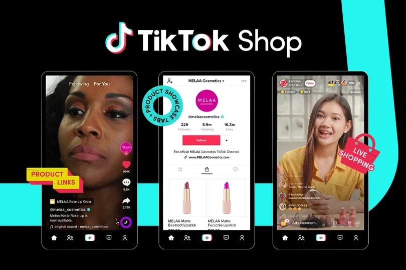
Social commerce integrates e-commerce directly into platforms like Instagram, TikTok, and Pinterest. It allows users to discover, evaluate, and purchase products without leaving the app.

Why It Matters
This creates frictionless shopping experiences. It meets customers where they already spend time and makes buying effortless.

How It’s Showing Up

  • TikTok “Shop Now” links tied to viral videos

  • Instagram Shops highlighting product collections

  • Live-stream shopping events hosted by influencers

The Short of it
For brands, social commerce is more than a sales channel — it’s a way to turn inspiration into instant action.

Why “Mocha Mousse” Is the Pantone Color of the Year and What It Means

Rebecca Rothstein September 15, 2025

Every year, Pantone selects a Color of the Year that reflects cultural moods, design trends, and what many people are craving. For 2025, that color is PANTONE 17-1230 Mocha Mousse, a rich brown hue imbued with warmth, comfort, and an earthy elegance.

What makes Mocha Mousse special
Mocha Mousse is more than a shade of brown. It suggests the comforting richness of cacao, the smooth depth of coffee, and the cozy luxury of chocolate. It is both refined and approachable. It offers a sensory experience—soft, indulgent, and familiar. Pantone describes it as balancing modernity with timeless beauty, and sophistication without pretension.

Why Pantone chose this color now
There are several reasons this hue resonates with the moment:

  • A widespread desire for comfort, solace, and calm. In uncertain times, people are leaning toward designs and aesthetics that soothe.

  • An increased focus on nature, authenticity, and sensory experiences. Mocha Mousse taps into organic textures, earthy tones, and a longing for honest, tactile experiences.

  • The trend toward slow luxury, thoughtful design, and pieces (fashion, decor, etc.) that feel lasting rather than fleeting. This color supports palettes that are grounded, versatile, and emotionally satisfying.

How to use Mocha Mousse in design, fashion, and beyond
Here are ideas for applying this warm brown in creative and effective ways:

  • Interior Design: Accent walls, upholstery, throw pillows, rugs—all can benefit from Mocha Mousse. Pair it with creams or off-whites for contrast, or with muted greens and soft gold for a richer, layered look.

  • Fashion & Textiles: Leather or suede jackets, silk blouses, knitwear—this color works beautifully in both luxe and casual pieces. It has the power to feel both neutral and statement depending on texture.

  • Brand & Visual Identity: Use Mocha Mousse in logos or packaging when the brand wants to convey warmth, reliability, and a grounded elegance. Interacting it with lighter pastel tones or deep contrasting shades can make it pop.

The Short of it
Mocha Mousse isn’t just a color. It’s a reflection of what people are longing for: comfort, connection, simplicity, and the indulgence found in small pleasures. For businesses, creators, and designers, it offers a palette choice that feels rooted, soulful, and adaptable. It reminds us that style isn’t always about loud statements. Sometimes it’s about the warmth, richness, and subtle elegance of the tones that cradle us quietly.

The Sydney Sweeney + American Eagle Campaign: What It Was and Why It Sparked Heat

Rebecca Rothstein September 15, 2025

American Eagle launched a denim campaign with Sydney Sweeney under the tagline “Sydney Sweeney has great jeans”. On its surface, it’s a fashion campaign: ads, videos, visuals highlighting jeans, confidence, style. But very quickly the campaign became a flashpoint — many people saw something more than denim.

What the Brand Said It Was Trying To Do

  • American Eagle’s official messaging emphasized that the campaign was always “about the jeans. Her jeans. Her story.” They pushed back on backlash by saying the focus is on self-expression, how people wear denim, confidence in fit and style.

  • The brand also signaled that the campaign was meant to be “bold” and provocative, using playful wordplay to get attention. They acknowledged it would “push buttons.”

  • Part of the campaign is a special product drop — “The Sydney Jean” — with a butterfly motif and with 100% of proceeds going to Crisis Text Line. The motif is said to represent awareness of domestic violence, something Sweeney has voiced concern about.

Where Critics Found Problems

  • Wordplay & Connotations: The pun between genes vs jeans got a lot of attention. Some people felt that calling out “my genes are blue” (or making “great genes” part of the conversation) especially with a blonde-haired, blue-eyed actress, flirted with ideas tied to racial beauty standards, whiteness, and even eugenics.

  • Western Beauty Standards & Representation: For many, the concern is that the campaign unintentionally reinforces a narrow beauty ideal. Critics argue American Eagle missed an opportunity to showcase more diversity in the visuals tied to the “genes/jeans” pun.

  • Tone & Timing: In a culture that is highly attuned to issues of identity, race, representation, such symbolic or linguistic choices are easily read as loaded. Some felt brand didn’t anticipate how something that seemed playful might trigger deeper reactions.

What Supporters Are Saying

  • Some people think the backlash is overblown. They argue the cynicism, reading race or ideology into a pun, is distracting from what’s meant to be simple: promoting jeans.

  • A number of followers welcomed the campaign’s playful approach. They appreciate brands that take some risk, that don’t try to be bland or hyper-safe. Some say this kind of provocation helps visibility and makes the product more memorable.

What American Eagle Did in Response

  • The company made a statement clarifying intentions: that the campaign is about jeans and confidence, not genetics.

  • They leaned into the charitable aspect, like the “Sydney Jean” product with proceeds to a nonprofit.

  • But as of many reports, Sydney Sweeney had not publicly issued a detailed response (statement or apology), though she remains associated with the campaign.

Lessons from the Debate

  • Word choice matters, especially when it relates (even tangentially) to identity, race, or biology. What may seem clever or cute to creators can land differently with audiences.

  • Diversity in perspective during creative development is crucial. Having more varied voices involved might catch where puns or taglines might carry unintended connotations.

  • Transparency & speed in response matters. When pushback happens, how a brand explains itself, what they own vs what they stand by, shapes public perception.

  • Risk vs reward in marketing: Provocative campaigns have potential upside — but they also have risk. Sometimes the media coverage and talk (even negative) does increase visibility. Sometimes too much negative overshadow the message.

The Short of it

The American Eagle + Sydney Sweeney campaign is more than a jeans ad. It reflects how in 2025, marketing lives in a space where identity, language, symbolism, and social history are all under the microscope. Brands aiming to be bold need to anticipate more than just visual design; they need an understanding of context. And even when intent is light, interpretation can be heavy. For marketers, creators, and brands, this is a reminder: playfulness has power, but it also comes with responsibility.

Cracker Barrel’s Logo Drama: Tradition vs. Modernization

Rebecca Rothstein September 14, 2025

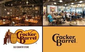
Cracker Barrel, the familiar highway-side restaurant chain known for its rocking chairs, antique decor, and southern comfort food, tried to modernize. They unveiled a new simplified logo and planned interior updates as part of a broader rebrand. But what followed was a swift and intense backlash. Within weeks, the company reversed its decision on the logo and suspended broader remodel plans.

What Cracker Barrel Was Aiming For

  • Refreshing relevance: The company’s leadership felt that Cracker Barrel was “losing relevance” and needed to evolve. The simplified logo and lighter, brighter interiors were intended to appeal more to younger customers and compete in a changing restaurant market.

  • Clarity and versatility: Minimalist designs travel more easily across digital platforms, signage, and smaller screens. The idea was to create a logo that is cleaner, more legible, and adaptable.

  • Brand evolution without losing identity: According to company statements, the intent was not to erase heritage, but to streamline and update while keeping what makes Cracker Barrel recognizable. The new branding was described as rooted in signature colors (gold, brown) and design elements from the barrel and word-mark.

Why People Were Upset

  • Attachment to nostalgia and identity: For many customers, Cracker Barrel is more than a restaurant. It’s a slice of Americana. The “Old Timer” figure (sometimes called Uncle Herschel) leaning on a barrel has been a visual anchor for decades, evoking feelings of home, tradition, comfort. Removing that imagery felt like erasing something meaningful.

  • Fear of “lost character”: Details matter. The antiques, dim lighting, rocking chairs—all contribute to a unique ambiance. Critics argued the modern look felt generic, sterile, or like the brand was abandoning what made it charming and distinctive.

  • Communication missteps: Many felt the rollout lacked empathy or sufficient explanation. The impression built that change was being imposed rather than shaped with customer input. Because so much of the brand identity is emotional, people felt blindsided.

  • Political and cultural overlay: In the current climate, design changes are often read through ideological lenses. Some critics labeled the redesign “woke,” seeing the removal of traditional symbols as part of broader cultural debates. That intensified reactions beyond pure brand aesthetics.

What Happened After the Backlash

Cracker Barrel responded by reversing course:

  • They reinstated the original logo with the “Old Timer” archetype.

  • Remodels beyond the test locations (4 out of over 660 stores) were suspended.

  • They promised to keep hallmark features: rocking chairs, fireplace, peg games, antiques, and the overall “Old Country Store” atmosphere that their customers love.

The Short of it

  • Branding isn’t just visual design. It’s emotional. A logo, decor, even color palette become repositories of memory and identity. When you change them, people feel change on a personal level.

  • Listening matters. When a brand with a loyal customer base acts fast in response to feedback, it shows respect. Cracker Barrel’s willingness to reverse decisions suggests that for many businesses, preserving trust may be more valuable than pushing through a risky modernization.

  • Modernization needs balance. Updating visuals, streamlining design, adapting to digital platforms—all are valid strategies. But when the base of what makes the brand beloved is deeply nostalgic or tied to experience, change should be incremental and clearly explained.

  • Cultural context is unavoidable. In 2025, logo changes can get caught up in wider cultural debates. Brands need to anticipate that and think ahead: not just what change they want to make, but who will see it, how they will interpret it, and how to manage narratives.

The Power of Networking

Rebecca Rothstein September 13, 2025

In business and in life, success often comes down to relationships. Networking is not just about collecting contacts. It is about building genuine connections that open doors, spark ideas, and create opportunities you may never have found on your own.

Why networking matters
Opportunities often flow through people, not postings. A single conversation can lead to a partnership, a job offer, or a new client. Beyond business, networking also provides mentorship, support, and inspiration from others who share similar goals.

What makes it powerful
The most impactful networking is authentic. It is about listening as much as speaking, and offering value rather than just asking for it. Strong networks are built on trust and reciprocity, not quick transactions. When people know you genuinely care, they are more likely to recommend you, collaborate with you, or help when you need it most.

How it works today
Networking has expanded far beyond the traditional handshake at an event. Social media platforms like LinkedIn, Instagram, and even TikTok have become powerful tools for making professional connections. Virtual communities and online groups provide new spaces to share knowledge, showcase expertise, and meet people across industries and geographies.

The Short of it
Networking is not a one-time activity. It is an ongoing practice of connecting, giving, and growing together. The relationships you build today may become the foundation of tomorrow’s opportunities. In a world that moves quickly, the power of networking is simple and lasting: people helping people succeed.

← NewerOlder →

Search Posts

No results found
Archive Block
The page connected to this block was deleted. Double-click here to select a different page, or check the recycle bin for the deleted page. Learn more
Post Archive
  • Adventures
  • Spotlight
 

Featured Posts

Featured
June 4, 2026
Everlane and Shein: A Branding Cautionary Tale
June 4, 2026
June 4, 2026
June 3, 2026
How to Make Your Brand Feel Human on Social Media
June 3, 2026
June 3, 2026
April 14, 2026
Pinterest at Coachella
April 14, 2026
April 14, 2026
April 8, 2026
The Devil Wears Prada 2- Culture as Campaign
April 8, 2026
April 8, 2026
January 29, 2026
When a Tweet Goes Too Far: What the Deleted Ritz Crackers Post Tells Us About Brand Voice
January 29, 2026
January 29, 2026
January 6, 2026
What to Expect from Super Bowl Ads This Year
January 6, 2026
January 6, 2026
December 3, 2025
Creativity Is Not a Commodity
December 3, 2025
December 3, 2025
November 27, 2025
Everlane’s New Logo: A Fresh Look for a New Chapter
November 27, 2025
November 27, 2025
November 20, 2025
The Rise of Tween Skincare: Why the Best Trend Might Be Letting Kids Be Kids
November 20, 2025
November 20, 2025
October 31, 2025
The Evolution of Halloween Marketing: From Candy Craze to Pop Culture Phenomenon
October 31, 2025
October 31, 2025