
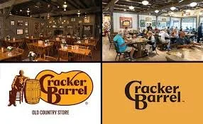
Cracker Barrel, the familiar highway-side restaurant chain known for its rocking chairs, antique decor, and southern comfort food, tried to modernize. They unveiled a new simplified logo and planned interior updates as part of a broader rebrand. But what followed was a swift and intense backlash. Within weeks, the company reversed its decision on the logo and suspended broader remodel plans.
What Cracker Barrel Was Aiming For
Refreshing relevance: The company’s leadership felt that Cracker Barrel was “losing relevance” and needed to evolve. The simplified logo and lighter, brighter interiors were intended to appeal more to younger customers and compete in a changing restaurant market.
Clarity and versatility: Minimalist designs travel more easily across digital platforms, signage, and smaller screens. The idea was to create a logo that is cleaner, more legible, and adaptable.
Brand evolution without losing identity: According to company statements, the intent was not to erase heritage, but to streamline and update while keeping what makes Cracker Barrel recognizable. The new branding was described as rooted in signature colors (gold, brown) and design elements from the barrel and word-mark.
Why People Were Upset
Attachment to nostalgia and identity: For many customers, Cracker Barrel is more than a restaurant. It’s a slice of Americana. The “Old Timer” figure (sometimes called Uncle Herschel) leaning on a barrel has been a visual anchor for decades, evoking feelings of home, tradition, comfort. Removing that imagery felt like erasing something meaningful.
Fear of “lost character”: Details matter. The antiques, dim lighting, rocking chairs—all contribute to a unique ambiance. Critics argued the modern look felt generic, sterile, or like the brand was abandoning what made it charming and distinctive.
Communication missteps: Many felt the rollout lacked empathy or sufficient explanation. The impression built that change was being imposed rather than shaped with customer input. Because so much of the brand identity is emotional, people felt blindsided.
Political and cultural overlay: In the current climate, design changes are often read through ideological lenses. Some critics labeled the redesign “woke,” seeing the removal of traditional symbols as part of broader cultural debates. That intensified reactions beyond pure brand aesthetics.
What Happened After the Backlash
Cracker Barrel responded by reversing course:
They reinstated the original logo with the “Old Timer” archetype.
Remodels beyond the test locations (4 out of over 660 stores) were suspended.
They promised to keep hallmark features: rocking chairs, fireplace, peg games, antiques, and the overall “Old Country Store” atmosphere that their customers love.
The Short of it
Branding isn’t just visual design. It’s emotional. A logo, decor, even color palette become repositories of memory and identity. When you change them, people feel change on a personal level.
Listening matters. When a brand with a loyal customer base acts fast in response to feedback, it shows respect. Cracker Barrel’s willingness to reverse decisions suggests that for many businesses, preserving trust may be more valuable than pushing through a risky modernization.
Modernization needs balance. Updating visuals, streamlining design, adapting to digital platforms—all are valid strategies. But when the base of what makes the brand beloved is deeply nostalgic or tied to experience, change should be incremental and clearly explained.
Cultural context is unavoidable. In 2025, logo changes can get caught up in wider cultural debates. Brands need to anticipate that and think ahead: not just what change they want to make, but who will see it, how they will interpret it, and how to manage narratives.