
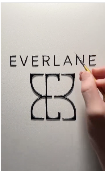
Everlane is stepping into a new era in 2025, and the most visible signal of that evolution is its updated brand identity. Under new leadership, the company has introduced a sleek monogram built from three stacked “E” shapes, along with a shift toward what they are calling “clean luxury.” It feels like a natural next step for a brand known for minimalism and transparency, but also a clear attempt to elevate perception and meet the expectations of a changing consumer base.
Why the New Symbol Matters
The monogram is simple, modern, and instantly recognizable. It gives Everlane a visual asset that can live on tags, packaging, campaigns, and social content. It also helps the brand stand alongside more premium fashion labels without losing its roots. Everlane has always promised timeless design and ethical production. The new mark reinforces those values while giving the brand a more polished edge.
This shift comes with deeper changes. Everlane is investing in longevity messaging, including an in-store denim repair program designed to keep clothing in circulation longer. Pairing a refined identity with a sustainability-focused initiative strengthens the brand story and helps Everlane stay relevant as the conversation around fashion waste grows louder.
A Strategic Move Toward Culture and Storytelling
Everlane is also leaning more into cultural relevance. Its recent campaign with Laufey shows a desire to move past strictly utilitarian basics and explore richer storytelling and aesthetic cues. This aligns neatly with the new brand mark, which feels more expressive than anything Everlane has used before.
What Works
The monogram is clean, flexible, and easy to recognize.
The updated branding pairs well with Everlane’s sustainability initiatives.
The changes feel modern without erasing the brand’s original identity.
The Short of it
Everlane’s new brand mark is not just a design update. It is a sign of growth and a way to reconnect with both longtime fans and new audiences. The refreshed identity supports a broader strategy that blends style, sustainability, and culture. It is a quiet but confident move that shows how a brand can evolve without losing its foundation.