
Domino’s Fresh Slice: Why the 2025 Brand Refresh Hits Different
When you see Domino’s new look this fall, it’s more than just a logo update. After 13 years, the pizza powerhouse is introducing a brand refresh that leans into craveability, visibility, and personality. The change reaches far beyond a new sign or color scheme. This is a full-scale reinvention designed to remind people why Domino’s remains one of the most recognizable brands in the world.
What’s Changing
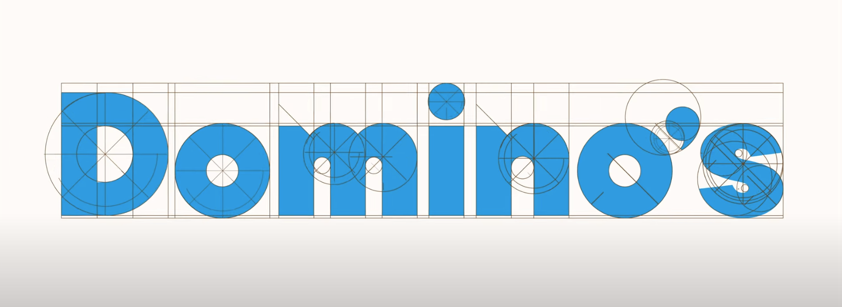
Domino’s has launched its first brand refresh in more than a decade as part of its “Hungry for MORE” strategy. The logo is sharper, the colors are richer, and the entire design feels brighter and more appetizing. The new look includes bolder typography through a custom typeface called “Domino’s Sans,” which features rounded letterforms that subtly echo pizza shapes. This gives the brand a more welcoming and modern feel.
The company also introduced something called the “cravemark.” It adds an audio and visual element that transforms the name “Domino’s” into a sound experience. The phonemic “mmm” in “Dommmmino’s” highlights the sensory appeal of the brand. To bring that to life, Domino’s partnered with artist Shaboozey, whose unique voice and cultural momentum add warmth and energy. His tone gives the jingle a soulful and memorable quality that helps Domino’s connect with younger audiences and music-driven culture.
Beyond the logo and jingle, the refresh extends to every customer touchpoint. The website, app, pizza boxes, employee uniforms, and store interiors have all been redesigned with this new look. Select menu items now arrive in elevated packaging that features black and metallic gold finishes, creating a more premium experience while keeping the brand approachable.
Why It Matters
This refresh is centered on craveability. Every design choice, from the color palette to the sound of the name, is meant to evoke hunger and excitement. Domino’s is shifting focus back to what matters most: delicious food and an engaging brand experience.
The company also managed to strike a balance between its heritage and modern appeal. The iconic red and blue colors remain, as does the familiar domino tile. What’s changed is how those elements appear. They feel cleaner, brighter, and more full of life. It feels like an evolution, not a departure.
In a crowded quick-service landscape, Domino’s is reminding consumers that food is both visual and emotional. Whether you are hearing the new “mmm” jingle or spotting the redesigned pizza box, the refresh creates a consistent and craveable experience across every platform.
What Works and What Might Be Risky
What Works:
The update feels confident and well-timed rather than reactive.
The “cravemark” and Shaboozey collaboration bring personality and cultural relevance.
Consistency across digital, physical, and audio branding strengthens recognition.
What Might Be Risky:
Some loyal customers may resist change to a familiar logo.
The rollout needs to be executed evenly across stores and regions to maintain brand integrity.
The jingle could feel polarizing if overused or taken too literally.
The Short of it
Modern branding is no longer just visual. It involves every sense, from sight to sound to emotional resonance. The collaboration with Shaboozey shows how a brand can use music and voice to connect authentically with its audience. When sound becomes part of brand identity, it builds recognition and emotional connection faster than visuals alone.
The key takeaway is that evolution can be bold without breaking tradition. Domino’s kept its familiar essence while turning up the flavor and energy for today’s digital-first audience.